5 Conversion-Centric eCommerce Design Examples for 2026
In the era of 5G internet, fast-paced online shopping, and an infinite number of alternatives for shoppers, your eCommerce website gets no more than 50 milliseconds to make a good first impression. It is inevitable to focus on conversion-centric design elements that guarantee meaningful growth in your business.
A conversion-centric design focuses on creating experiences with a single goal in mind. It uses persuasive design and psychological triggers as conversion techniques to compel visitors to take that one specific action.
According to 73.1% of web designers, most of the visitors leave your website when you have a non-responsive design. So, how do you use design to persuade a visitor to complete your conversion objective? To focus a visitor’s attention on the targeted area of interaction, a variety of design aspects can be used. Psychological assistance can also help to increase participation. Here are a few eCommerce brands that have seamlessly done the job.
1. Discord

Discord is a one-of-a-kind audio and messaging application curated for the online streaming and gaming industries. It allows users to create channels to connect with anyone around the world. The app has gained a lot of popularity in the shortest span of time and has become an indispensable part of Gen Z and the gaming community. This can be easily attributed to the brilliant design and flawless user experience on both the website and the application.
The home page hits all the right spots that can intrigue their target audience and encourage them to try it out. They have a simple navigation bar that highlights the features of the platform, like the premium (Nitro) version and the safety provided by the service. The pages have a crisp copy that conveys the app’s value propositions, along with enticing contrasting Call To Action (CTAs) placed strategically.
The design is sleek with plenty of white space, a quick load time, high responsiveness, and intuitive navigation, making it one of the best website designs out there. Visually, the website immediately catches the visitor’s interest with entertaining illustrations of the home as well as landing pages.
2. Bliss
Bliss is a wonderful eCommerce site with a pastel-coloured eCommerce design. The website is cotton candy for the eyes. To visually appeal to their key buyer groups, this skincare firm uses three dominant colours: Millennial pink, baby blue, and Gen Z yellow.
Bliss’ marketing and branding, including their website, exudes a sense of playfulness. A single glance at the website is enough to fill the viewer with happy feelings. They’re also great at photographing eCommerce products. The large photos, gorgeous colours, and easy-to-use buttons all contribute to a visually appealing and well-organized website.
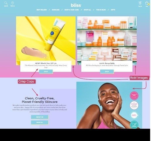
The company makes and distributes a variety of skincare products, such as masks and face washes, among other things. Microcopy further reinforces the brand’s unique and approachable attitude. The button content, section headings, and form descriptions are written in a way that makes you feel like you’re discussing your skincare routine with a buddy.
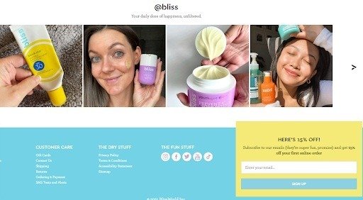
In addition to this, they display user-generated content on their website that seems way more genuine and is preferred by 90% of the audience. The visitors can see real people using the products and instantly a trustworthy rapport is built in their minds.
3. Slack
Slack is another great example of a conversion-centric website design. The page attempts to build focus and nudge the leads to complete one goal at a time. This works wonders as the users are not confused and overwhelmed with multiple types of calls to action like downloading the app, subscribing to the newsletter, and following the eCommerce business’ social media pages. Such designs often lead to increased bounce rates rather than improving conversions.
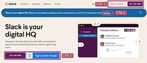
The designing team at Slack wins brownie points for their textbook yet elegantly implemented structure. They follow the Z-Pattern layout for their homepage, strategically placing the CTAs where the users tend to notice, consciously or subconsciously.
This is best when you are creating an eCommerce website that is light on copy but has more hero images, videos or illustrations. The essence of this pattern usually followed by developers is that alternating between left and right-aligned content blocks helps structure the page in an appealing way. Such patterns create a natural flow as the visitor scrolls down the page.
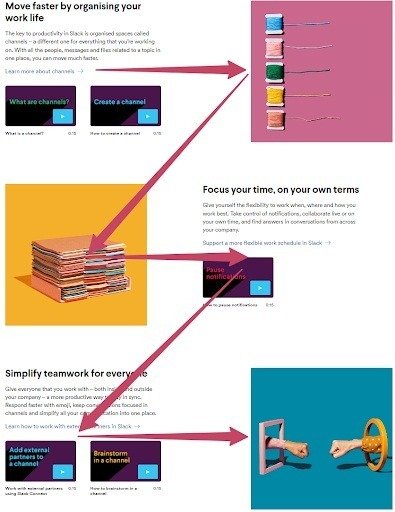
Slack is equally responsive on desktops as well as mobile devices. They take advantage of fluid grids, which convert a two-column desktop layout into a single-column smartphone style. Alongside, they employ a carousel to present graphics to save space and keep the page from becoming too long. Each block of data demonstrates the benefit Slack can provide to its users. Slack’s website is a wonderful example of effective web design due to its simplicity.
4. Home Depot
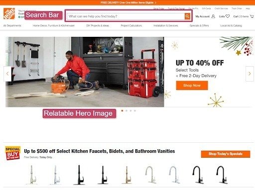
Most people imagine going to a brick, and mortar store in person to look at all of the useful tools, hardware, and materials available for their next DIY project. Home Depot’s website’s distinguishing strength is its ability to transmit this experience online. Home Depot has crystallised its deep insights about its customers in some spectacular ways on its website.
The visuals, either images illustrations or colours are the first things that the visitor notices. Home Depot nails this aspect by having an image that depicts its tools in action with a relatable image for the home page and landing pages. This acts like an aspirational mirror for the target audience wherein it reflects the emotional state your customers are hoping to achieve. Also, the banner displaying a timely promotion creates a sense of urgency in the visitor.
The search bar is situated on top, available for someone who wants to find whatever they require, quickly. The top-level sub-category menu gives you quick access to more precise product categories. As the visitor scrolls down, the text density increases. This provides the page with a tidy, informative appearance.
You can search by room of the house or project, just like you would in a store, rather than by product category, as many other eCommerce sites do. Home Depot, like many other eCommerce behemoths, relies largely on fast, free shipping through advanced order fulfillment technology to neutralize its advantage.
5. ColourPop
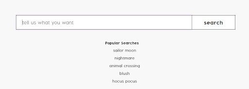
On ColourPop’s website, the search pattern is positioned in the upper right corner, as it is on most websites. When you click the universal magnifying glass icon, a giant search bar appears, along with some clever microcopy that says “tell us what you want.” This pattern adds some on-brand flair to a common design pattern that isn’t necessarily pleasant to interact with.
The forms on ColorPop’s website are simple and straightforward. The input fields are scannable and properly labelled. There is no superfluous visual styling or distracting information. Furthermore, the black ‘enter’ buttons stand out against the white background and are difficult to overlook.
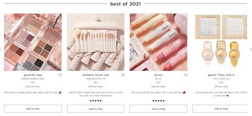
The product grid has a clear and constant visual hierarchy, making it one of the most essential patterns on the ColourPop website. The main focus is on product photos, followed by call-to-action buttons and text-based product information. The images are not only eye-catching (dare I say, magical), but the text has been organised in a structured and clear manner, making this pattern a highly effective solution. Since 85% of shoppers consider product information and pictures to be very important while making a purchasing decision, acing that department works in ColourPop’s favour.
Summing up
Every tip and trick in the book for creating better landing pages is based on these ideas. Put them to work on your next marketing effort, and you’ll notice a difference in how your page appears and feels right away. Even your designer friend who keeps a colour wheel on their desk will be blown away.
- Create a focal point and a framework
- Maintain the consistency
- Showcase the advantages to attract attention to the brand
- Reduce the amount of friction.
But there are still a lot of ways to get creative and test out new concepts within these principles—so how do you determine whether your design is actually working to increase conversions? That’s when things start to become interesting. Because there is no such thing as a perfect design that will appeal to everyone. You have to experiment and test until your website has all the elements that attract your target audience.


About Author
Micky Joseph
Micky is a passionate blogger, who writes enriching posts on web design, web development and technology news. He loves writing about web development, tips, tools, tutorials, cloud, hosting, domain, and also sharing knowledge about latest technology news. He also writes about cms, programming language and various software. Follow us on FlipBoard.